A/B testing is one of the most effective strategies for marketers to optimize campaign performance and boost conversion rates. By comparing two different variations of an ad, landing page, or website element, businesses can identify which version resonates better with their target audience.
In this article, NEMI Ads brings you over 10+ real-world A/B testing examples to give you practical insights into how split testing can drive results. Whether you’re new to A/B testing or looking to refine your strategy in 2025, these case studies will provide valuable inspiration. Stay tuned with NEMI Ads and discover how to run smarter experiments and make data-driven marketing decisions!
A/B Testing Examples in Website Design
Going
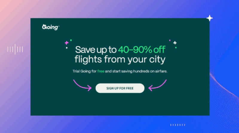
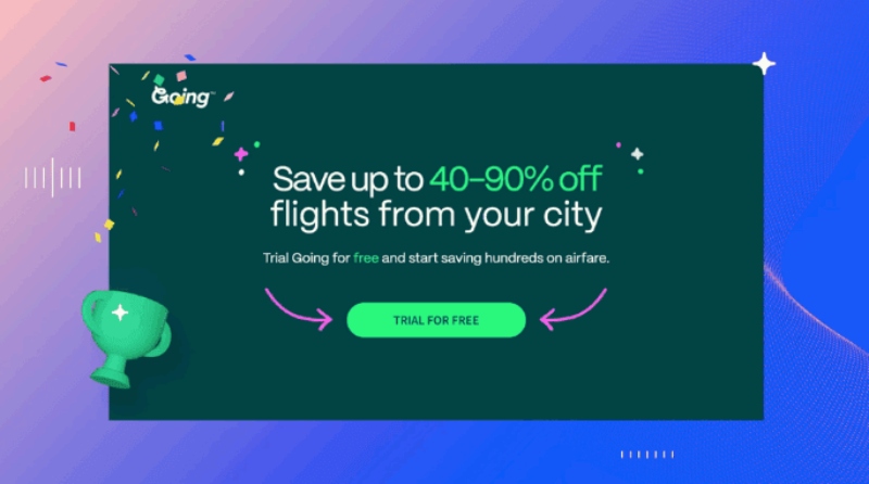
One of the most practical examples of A/B testing in website design comes from Going—a travel service company. Despite running multiple promotional campaigns, they still failed to achieve their expected conversion rate. After a website audit, the team discovered that the problem lay in the phrasing of their Call-to-Action (CTA) button.
To validate this hypothesis, Going launched a split testing experiment, comparing two variations of the CTA to see which one would perform better.
Split Testing Setup:
- Version A: “Sign up for free”
- Version B: “Trial for free”
Results:
The second CTA—“Trial for free”—led to a 104% increase in monthly trial sign-ups, showing just how powerful minor adjustments in messaging can be.
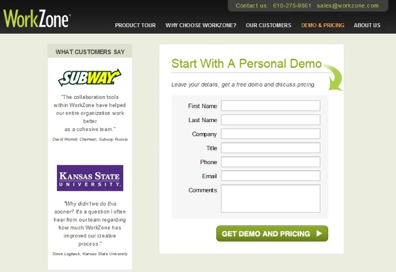
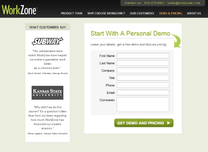
WorkZone
Another compelling entry among practical examples of A/B testing is WorkZone-a company providing project management solutions and document collaboration tools for B2B clients. For a brand like WorkZone, credibility plays a critical role in convincing clients to engage, especially given the nature of their services.
To enhance trust, WorkZone decided to include customer testimonials on their lead generation page. However, they quickly noticed an issue: the testimonial section was too visually dominant, distracting users from the lead capture form. To address this, WorkZone ran a split testing experiment to determine the most effective design layout.
Split Testing Setup:
- Version A: Original design featuring yellow-white “Subway” text and a purple logo.
- Version B: Revised version using a minimalist black-and-white color scheme.
Results:
After a 15-day testing period, Version B emerged as the winner. The simplified color scheme helped increase the form completion rate by 34%, with a statistical confidence of 99%.
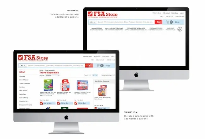
FSAstore
FSAstore is an e-commerce company that specializes in household items for customers with Flexible Spending Accounts (FSA). While the website has the potential to serve over 35 million FSA account holders, its interface was cluttered with too many options, particularly on product category pages.
The development team realized that this overwhelming design might lead to decision fatigue and negatively affect conversion rates. To address this, FSAstore conducted an A/B test to evaluate a more minimal version of their website — making it a noteworthy addition to A/B testing examples in e-commerce.
Testing Method:
- Version A: Original website with a detailed subheading and extensive navigation options.
- Version B: A simplified version with the subheading removed from the navigation section.
Results:
The design change yielded surprising results. Version B, which removed the subheading, significantly improved the conversion rate (CR). More impressively, revenue per visitor increased by 53.8%, showcasing how a streamlined design can drive user decisions and enhance site performance.
Examples of A/B Testing in Facebook Ads
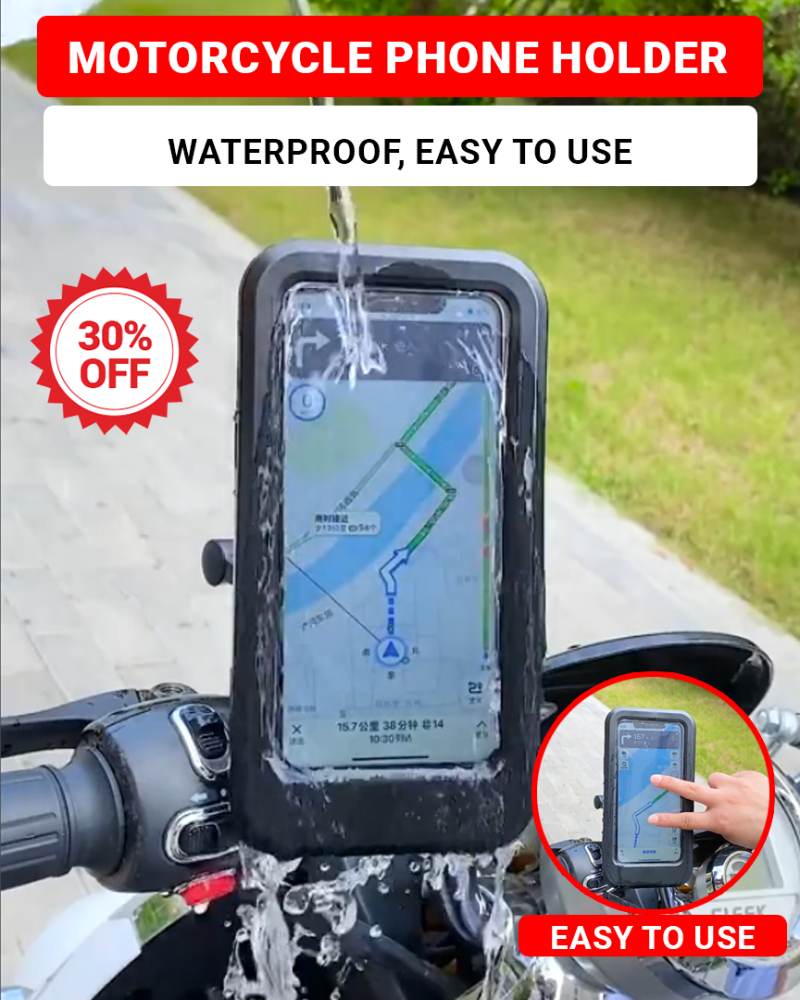
Phone Holder
In a Facebook Ads campaign for a phone holder product, NEMI Ads conducted a split test to determine which content format would deliver better ad performance — another insightful addition to real-world examples of A/B testing.
Testing Method:
- Version A: Static image, focusing on highlighting the product with a clean layout and concise messaging.
- Version B: Short video emphasizing convenience of installation, waterproof features, and touchscreen usability.
Results:
The video version (B) outperformed the static image with a CTR of 4% and a Cost Per Result of $2.95. In contrast, Version A (image) only achieved a CTR of 2.39% and incurred a cost 3.8 times higher per result. This demonstrates how dynamic content, especially video, can significantly boost user engagement and campaign efficiency — a key insight for those seeking A/B testing examples in advertising.
Magnetic Anti-Snoring Nose Clip
Captions not only enhance accessibility by allowing viewers to understand video content without sound, but they also improve clarity and drive higher conversions. To assess how different caption styles affect ad performance, NEMI Ads ran a split test using two video versions of an ad for an anti-snoring nose clip.
Testing Method:
- Version A: “Magnetic Anti-Snoring Nose Clip – Improve Sleep, Enhance Health.” This version included comprehensive details — product material, primary function (anti-snoring), and broader benefits like sleep improvement and overall health enhancement.
- Version B: “Anti-Snoring Nose Clip – Improve Your Health.” This version was more concise, focusing on the main benefit but omitting product material information.
Results:
Version A captured more attention and outperformed Version B, generating a 30% increase in CTA clicks. This suggests that detailed captions, especially those clearly outlining the product’s value proposition, instill more confidence in potential buyers — making it a standout in split testing examples involving video content.


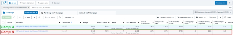
Voltage Tester Pen
A successful Facebook Ads campaign depends not only on the content but also on how well the ad is targeted. Proper audience targeting improves ad delivery and maximizes campaign effectiveness. However, in some cases, not targeting at all might perform better.
To determine the most effective targeting strategy for a voltage tester pen campaign, NEMI Ads conducted an A/B test over 10 days, comparing targeted vs. non-targeted audiences.
Testing Method:
- Version A: No audience targeting.
- Version B: Targeted at engineers and electricians.
Results:
Version B significantly outperformed Version A, achieving a CTR 1.5 times higher and a 35% increase in completed purchases. This demonstrates that precise targeting not only enhances ad delivery but also ensures the message resonates with the right audience — leading to more clicks and conversions. In this case, clear audience segmentation proved to be the optimal strategy.
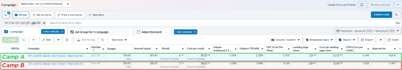
Metal Cutting Blade
Consumer behavior varies greatly depending on the device they use — especially in social media shopping environments like Facebook. One often overlooked factor influencing campaign performance is the user’s device type. Different devices can lead to different engagement rates and conversion behaviors.
Recognizing this, NEMI Ads launched a split test for their Metal Cutting Blade product, running for 7 days. The audience was divided into two segments: mobile users and desktop users. The goal was to identify which device segment yielded better results and optimize ad content accordingly.
Testing Method:
- Version A: Targeted desktop users.
- Version B: Targeted mobile users.
Results:
After 15 days of testing, Version B (mobile users) showed superior performance, with a CTR 35% higher than Version A. Additionally, CPC was lower and conversion rates were double compared to the desktop-targeted version. This suggests that construction-related buyers are more likely to use mobile devices on-site — making mobile targeting a highly effective strategy.
A/B Testing Examples in Other Social Media Ads
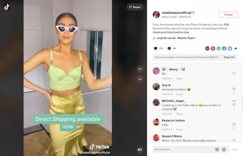
Vestaire on TikTok
Fashion brand Vestaire aimed to increase its presence on TikTok among Gen Z users and promote its new in-app shopping feature.
Testing Method:
To reach these goals, Vestaire’s influencer marketing agency partnered with 8 influencers, each tasked with creating content that included a clear call-to-action (CTA). Importantly, influencers were given full creative freedom, resulting in a wide variety of content styles and approaches.
The agency then conducted an A/B test to determine which type of content resonated best with the audience. The top-performing creatives – identified through metrics such as engagement and click-through rate — were scaled through paid advertising to maximize results.
Results:
By focusing ad spend on content that proved most effective through A/B testing, Vestaire successfully generated over 4,000 app installs, while reducing cost-per-install by up to 50%. This is a compelling split testing example in social media ads, showcasing how data-driven content selection can amplify campaign ROI.
Examples of A/B Testing in Landing Pages
Bamboo Seat Cushion
The headline is the very first thing a user sees upon landing on a page — it sets the tone and creates a strong first impression of the product or service. A short, compelling headline can spark interest and encourage visitors to explore further, ultimately driving them toward conversion.
Recognizing this, NEMI Ads ran an A/B test while optimizing the landing page for their Bamboo Seat Cushion — a product aimed at drivers seeking a more comfortable and cooler seating experience.
Testing Method:
- Version A: “Bamboo Seat Cushion – Reduce Pain, Increase Comfort”
Focused on the natural material and the comfort it provides. - Version B: “Stay Cool While Driving – No More Sweat with Bamboo Seat Cushion”
Targeted a specific user pain point: the discomfort of sweating while driving long hours in hot weather.
Results after 7 days of split testing:
- Version A:
- CTR: 3.8%
- Conversion Rate (CR): 5.5%
- Time on page: 1 min 45 sec
- Version B:
- CTR: 4.9%
- CR: 8.2%
- Time on page: 3 min 12 sec
Key Takeaway:
Version B clearly outperformed Version A in both click-through rate and conversion rate, while also increasing time spent on the page. This test highlights a critical lesson in landing page A/B testing examples: headlines that address a customer’s pain point — in this case, the discomfort of sweating while driving — are far more effective than generic benefit-driven statements. Understanding what truly matters to your audience can significantly elevate engagement and conversions.


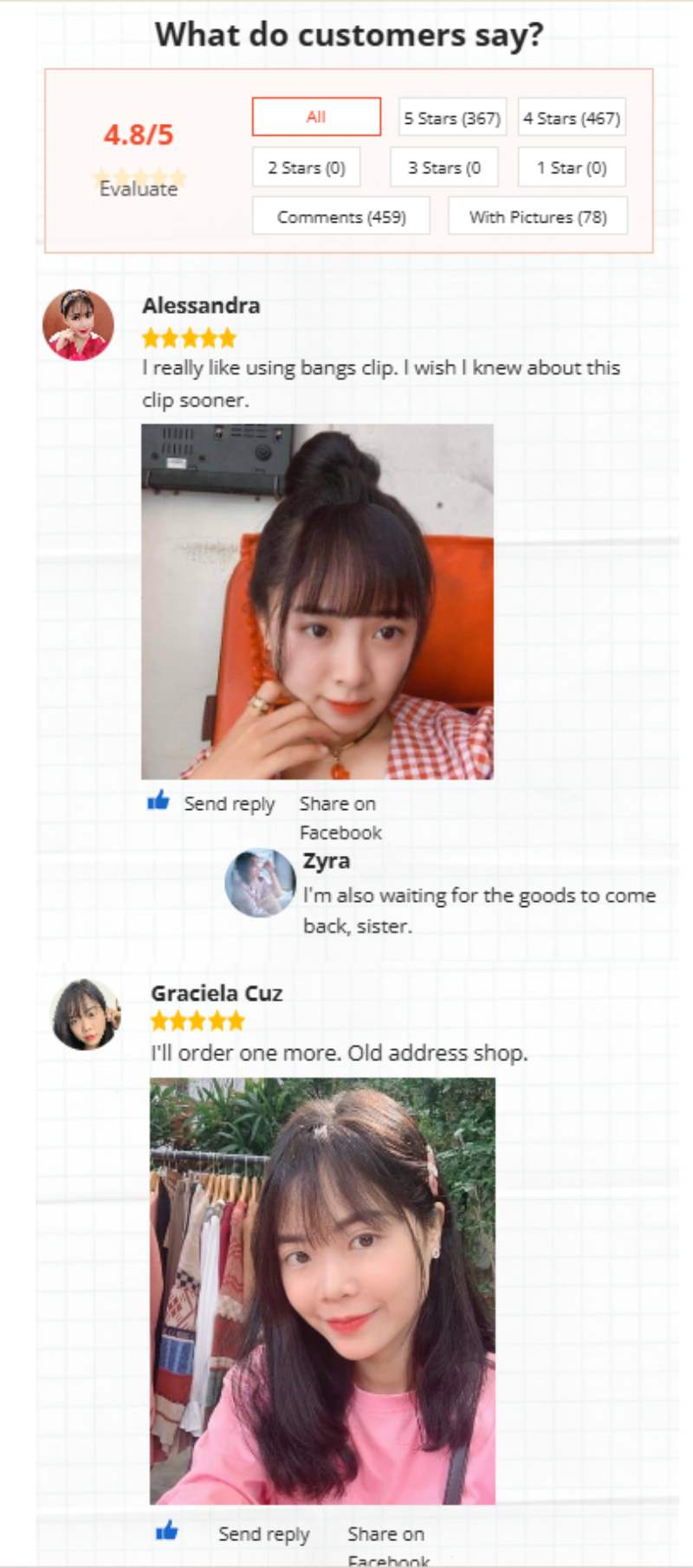
Clip-in Bangs (Fake Fringe)
According to marketing experts, customer reviews and social proof are incredibly powerful in shaping buyer behavior — especially in the beauty and fashion industries. That’s why NEMI Ads conducted a six-week A/B test to determine if adding real customer feedback to the landing page would improve conversion rates for their Clip-in Bangs product.
Testing Method:
- Version A: A traditional landing page explaining product features and benefits.
- Version B: Included real customer testimonials with images, showcasing how the product looked on various face shapes.
Results:
Version B achieved a 24% higher conversion rate and a 19% increase in average time on page compared to Version A. This clearly demonstrates how authentic feedback builds trust and encourages purchase decisions, especially when customers can visualize results on people like themselves.
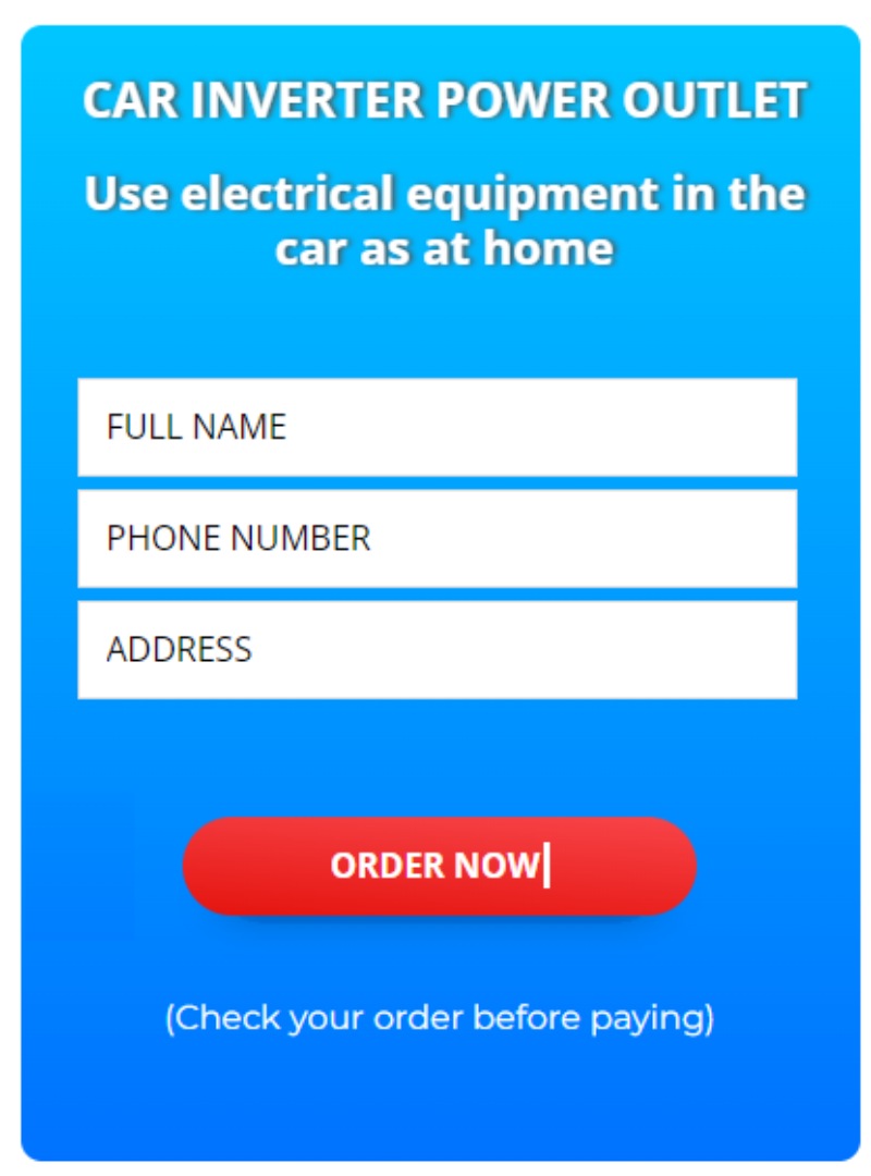
Car Inverter Power Outlet
When optimizing the landing page for their Car Inverter Power Outlet, NEMI Ads focused on one of the most important elements: the Call-to-Action (CTA). They launched a 10-day A/B test comparing two CTA styles to determine which one better encouraged user engagement.
Testing Method:
- Version A: CTA – “ORDER NOW”, prompting users to make an immediate purchase.
- Version B: CTA – “CONTACT NOW”, inviting users to get in touch for consultation.
Results:
Landing Page B saw a 25% higher CTA click-through rate than Page A. This result aligns with buyer behavior for automotive accessories — where compatibility questions (such as fit with specific car models) often arise. In this case, giving users the chance to speak with a consultant helped ease their concerns, leading to more confident buying decisions.

These 10+ real-world A/B testing examples highlight one simple truth: small changes lead to big results. Whether it’s modifying a headline, changing your visuals, rewording your CTA, or adding customer reviews — each element can significantly affect how users respond.
A/B testing isn’t just about guessing what might work — it’s a data-driven approach to understand your audience, optimize your budget, and maximize conversions. Want more tips like these? Keep checking back with NEMI Ads for fresh, actionable insights that help you grow faster and smarter.